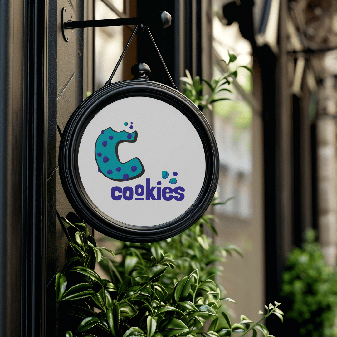
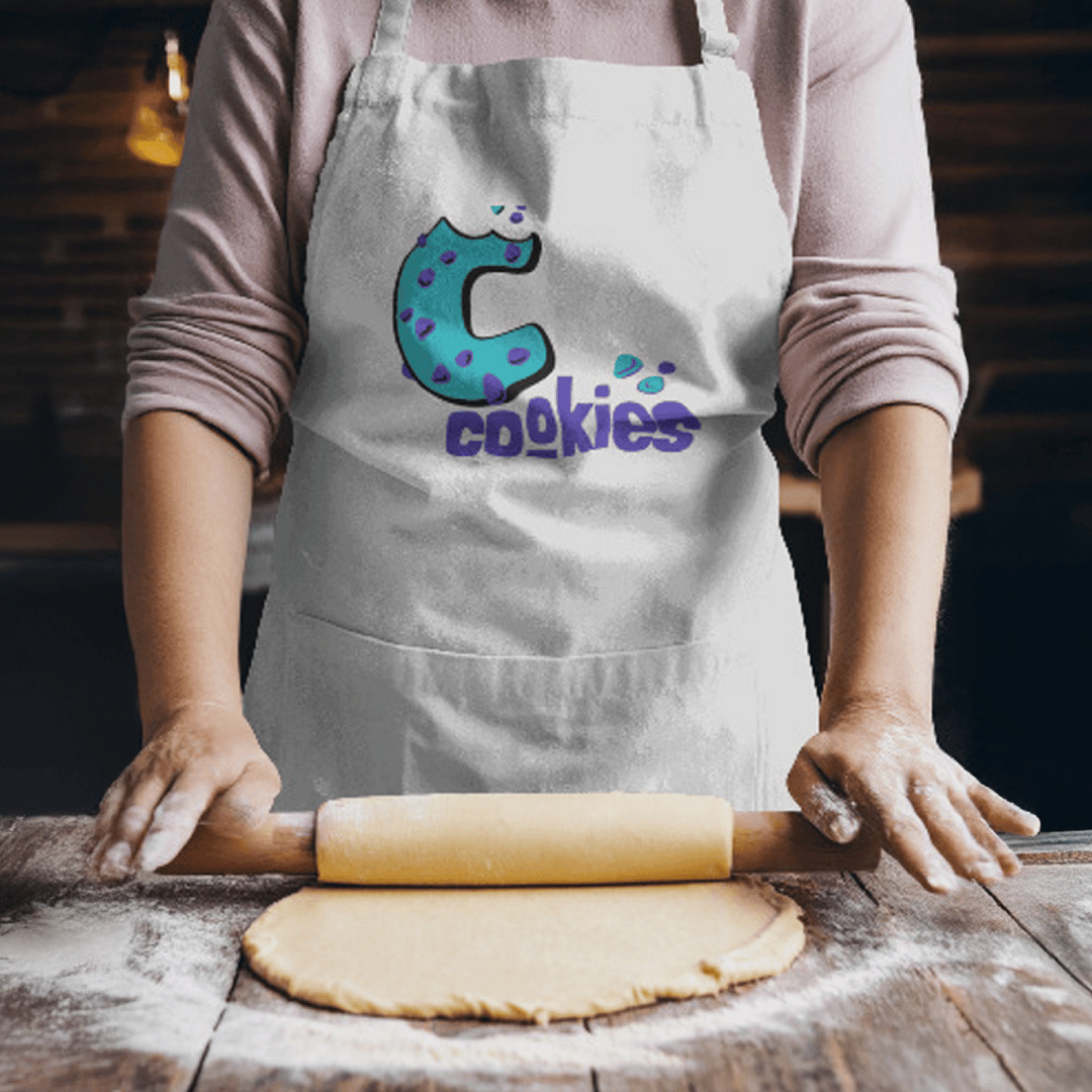
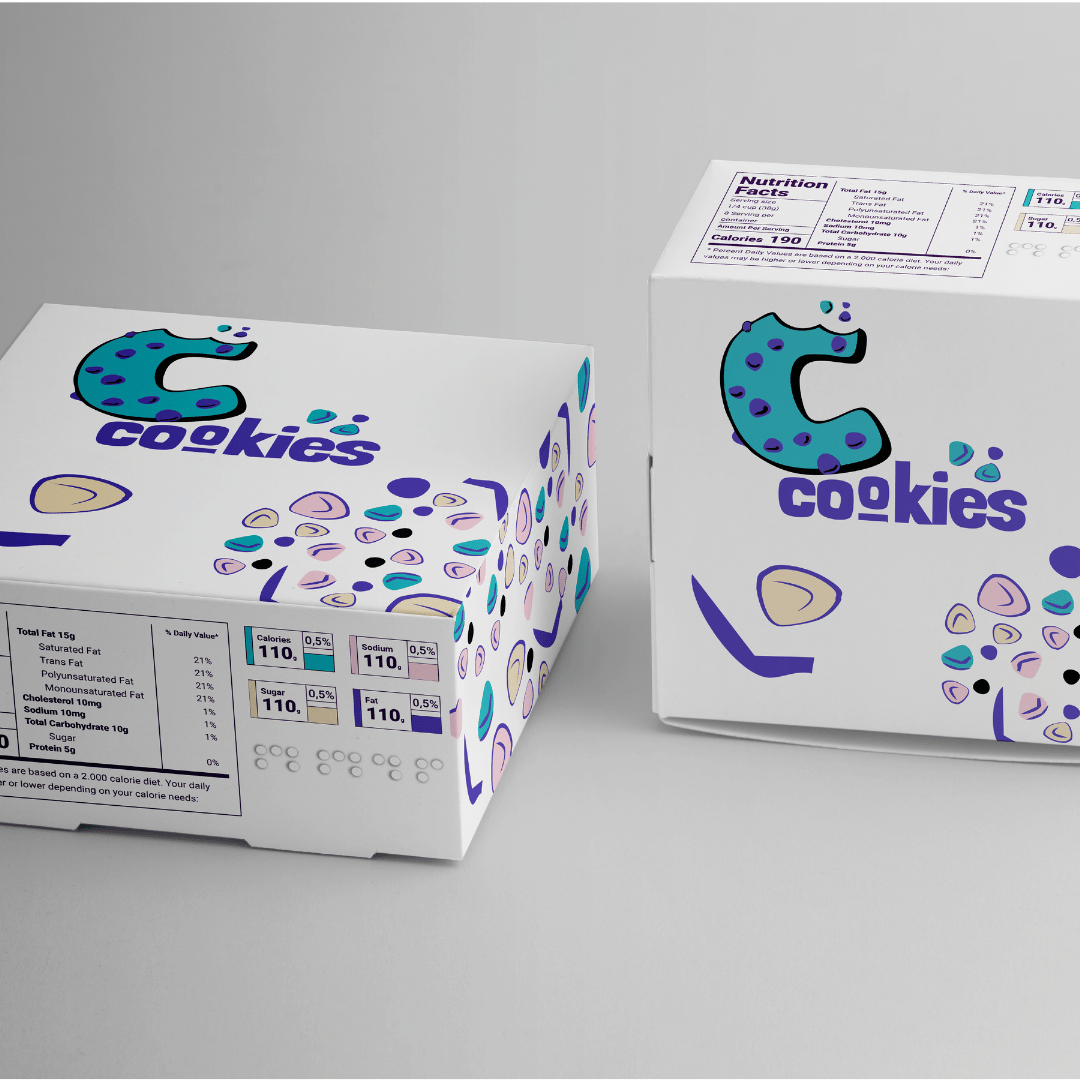
CCookies needed a playful, memorable, and modern brand identity that brings joy to the dessert experience. Our goal was to build a visual system that feels youthful, warm, and instantly crave-worthy — from the logo to the packaging to every customer touchpoint. We focused on creating a cohesive identity using fun shapes, soft colors, expressive typography, and mouth-watering photography to elevate CCookies from a simple bakery to a lifestyle sweet brand.
Client
CCookies
Services
Branding, E-Commerce Website, Photography, Social Media Content
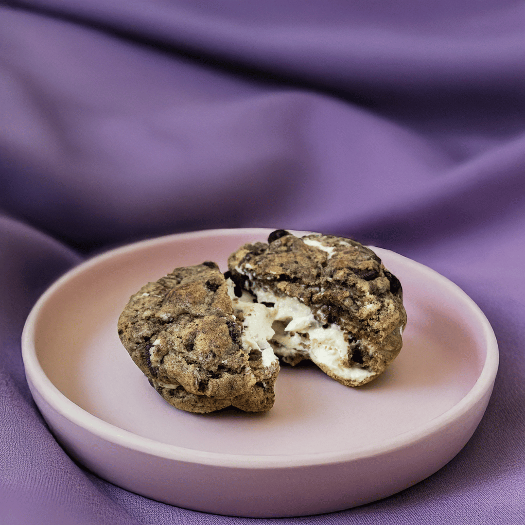
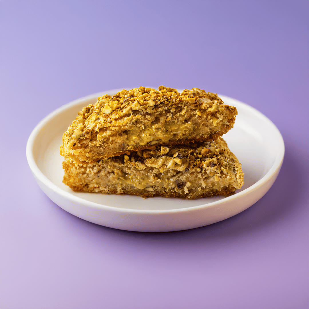
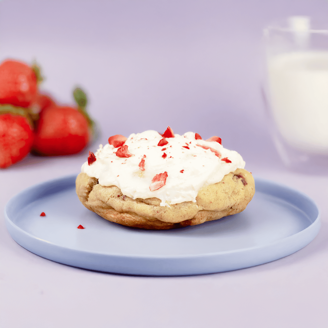
We developed CCookies’ full brand identity to reflect comfort, nostalgia, and fun. The direction blends playful illustrations, rounded typography, soft pastel tones, and bold cookie visuals to build an instantly recognizable brand. Every element was designed to feel friendly, warm, and irresistible — communicating the joy of fresh-baked cookies in both digital and physical experiences.
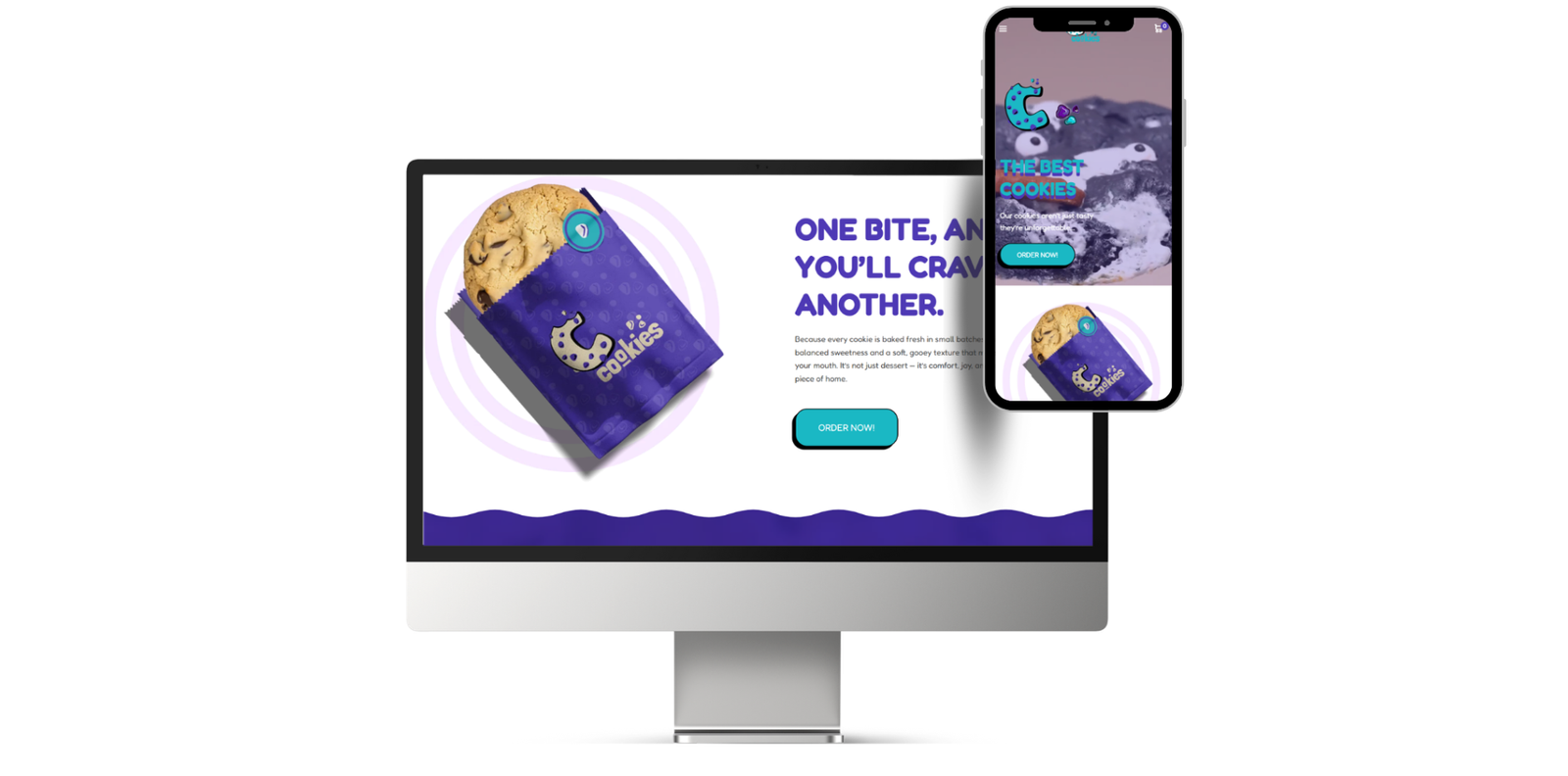
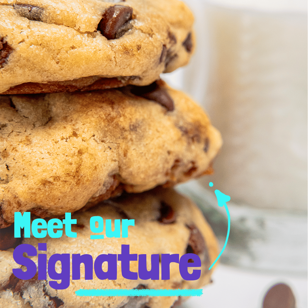
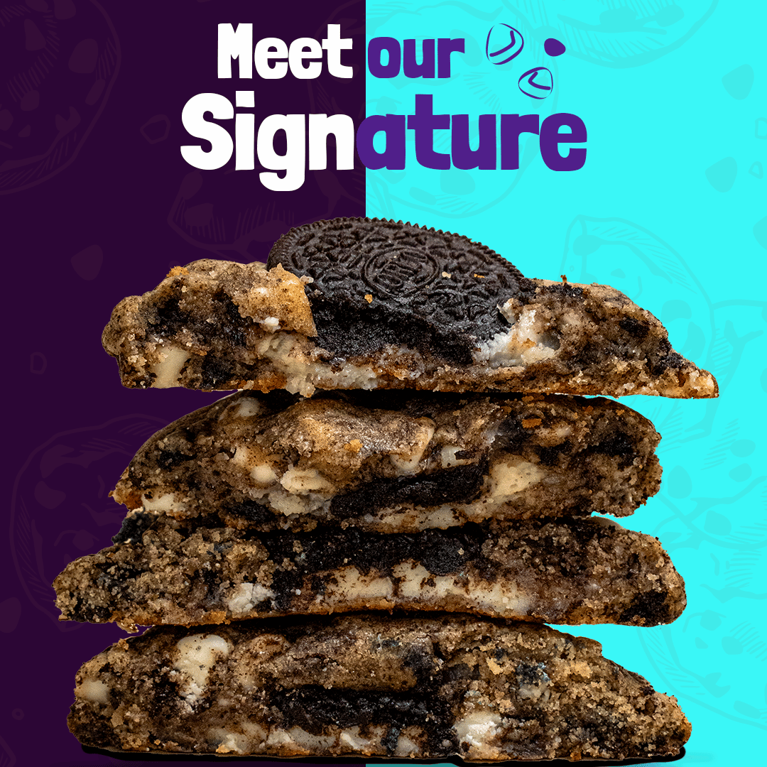
Our goal was to create an e-commerce and social presence that looks delicious, feels inviting, and converts. The website was designed to be fast, simple, and visually driven — letting the product shine through bold food photography and clean layouts. For social media, we built a consistent content system with engaging messages, fun typography, and product-focused visuals, ensuring CCookies stays top-of-mind (and top of cravings).
The visual identity was built around rounded shapes, soft gradients, and a friendly mascot-inspired logo that communicates sweetness and approachability. We focused heavily on photography to capture textures, warmth, and real cookie moments. Packaging was designed to be fun and clean, making the brand feel premium yet playful. Across digital platforms, we used bold headlines and pastel blocks to guide attention and create a smooth, appetizing experience.